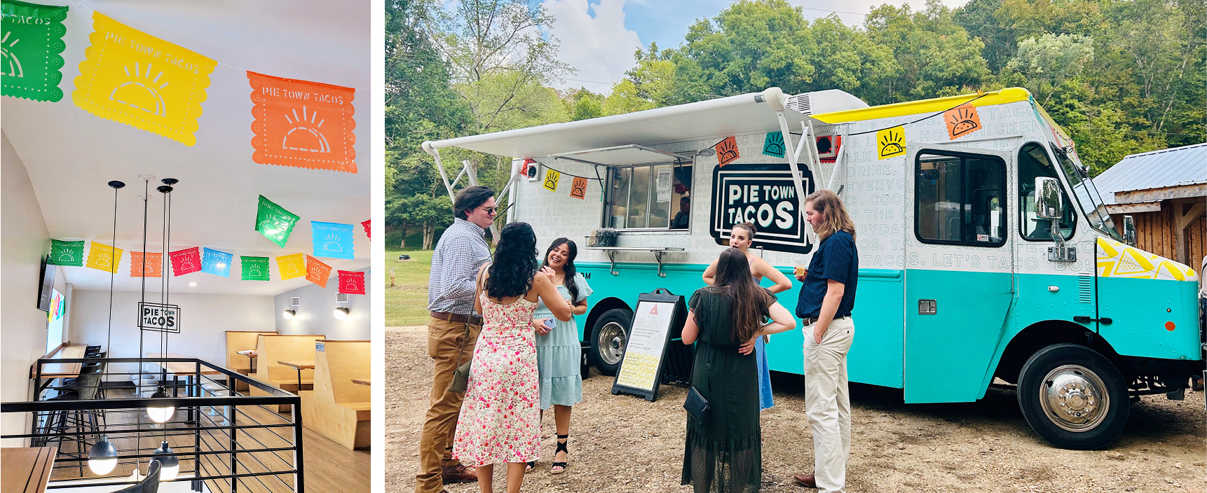
SIGNAGE
FOOD TRUCK DESIGN
Stand Out, Indeed
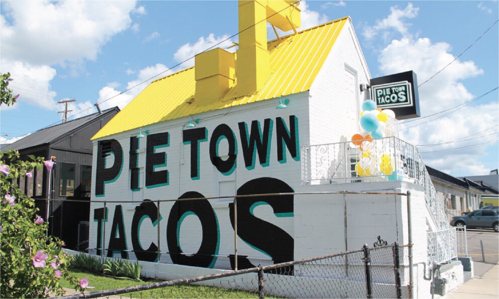
With the rise of mural culture, we saw an opportunity to make Pie Town Tacos’ first location truly stand out in its industrial surroundings. A few coats of sunshine-yellow paint on the roof, paired with a bold, in-your-face mural, instantly transformed the space into a landmark.
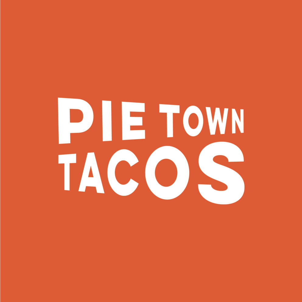
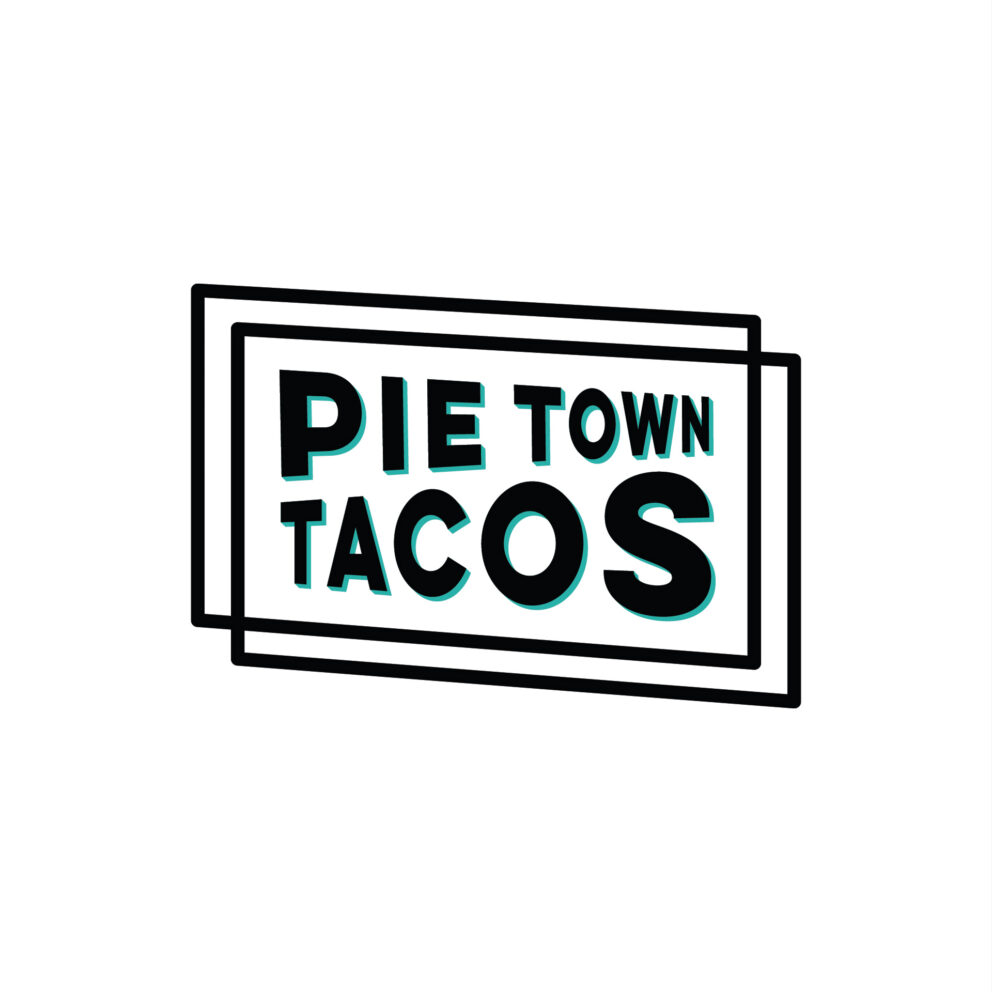
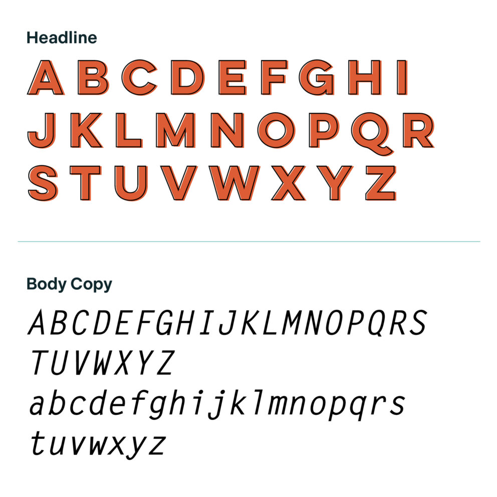
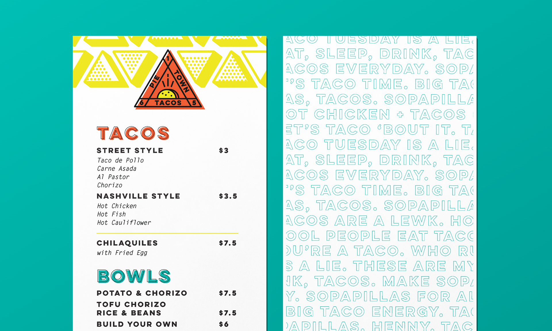
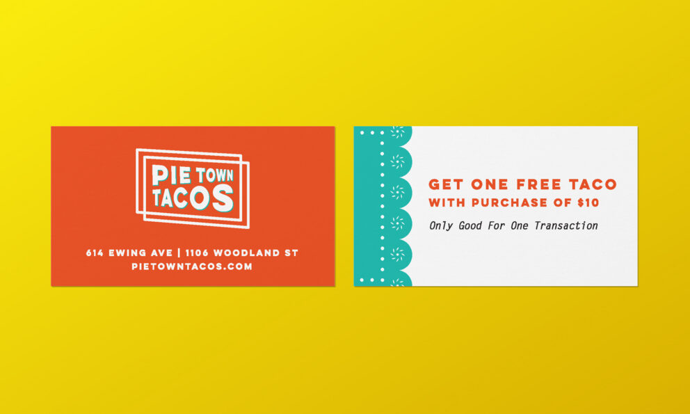
We carried this energy through every detail of the physical experience — from eye-catching signage to thoughtfully designed menus and playful décor elements across both brick-and-mortar locations. Each touchpoint was crafted to create a welcoming, one-of-a-kind vibe that perfectly pairs with the bold, flavor-packed food.
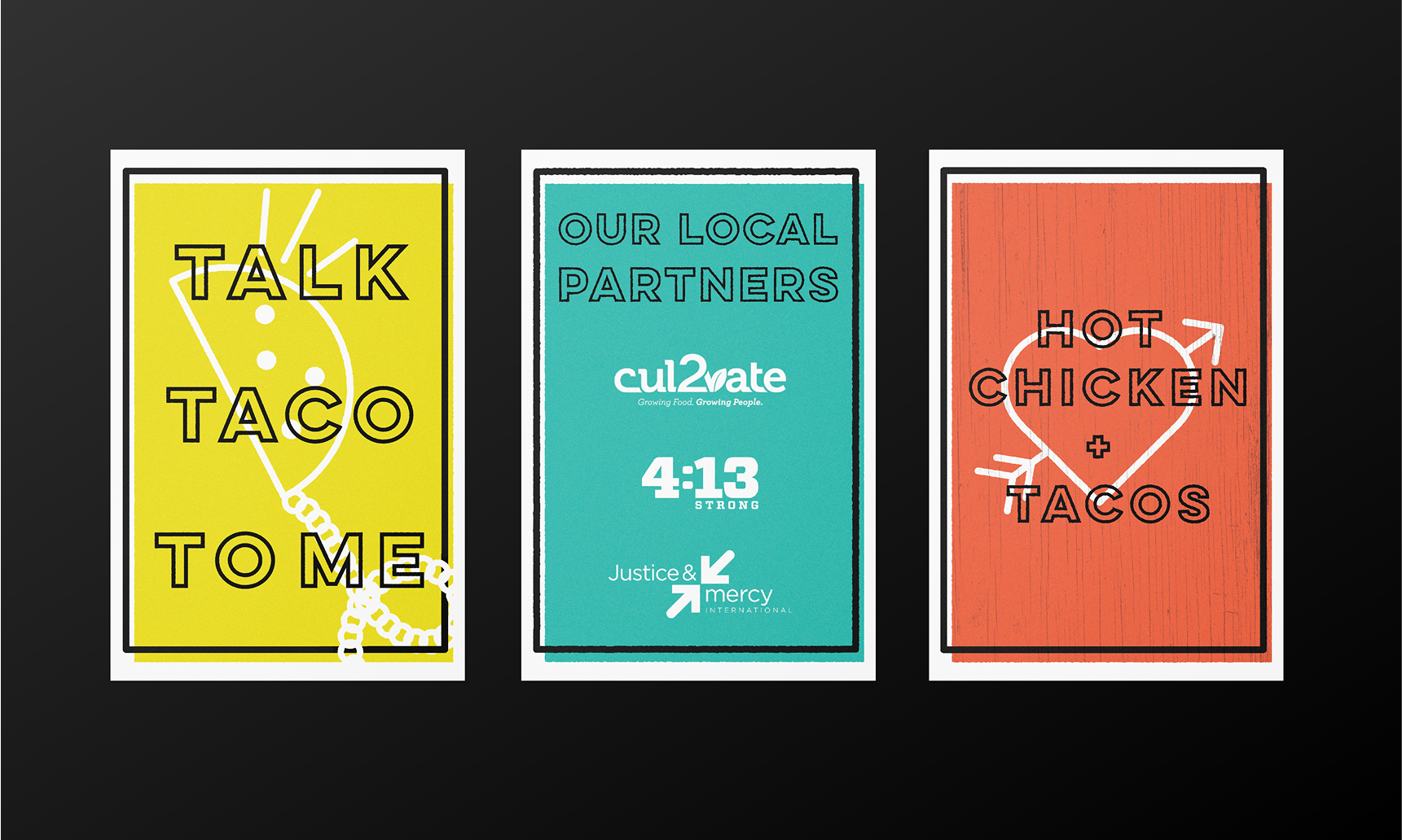
And the food truck? It’s just as fun. With custom papel picado-inspired graphics and bold colors, it’s impossible to miss. Whether parked at a festival or cruising through the city, the truck brings the party (and the tacos) wherever it goes.


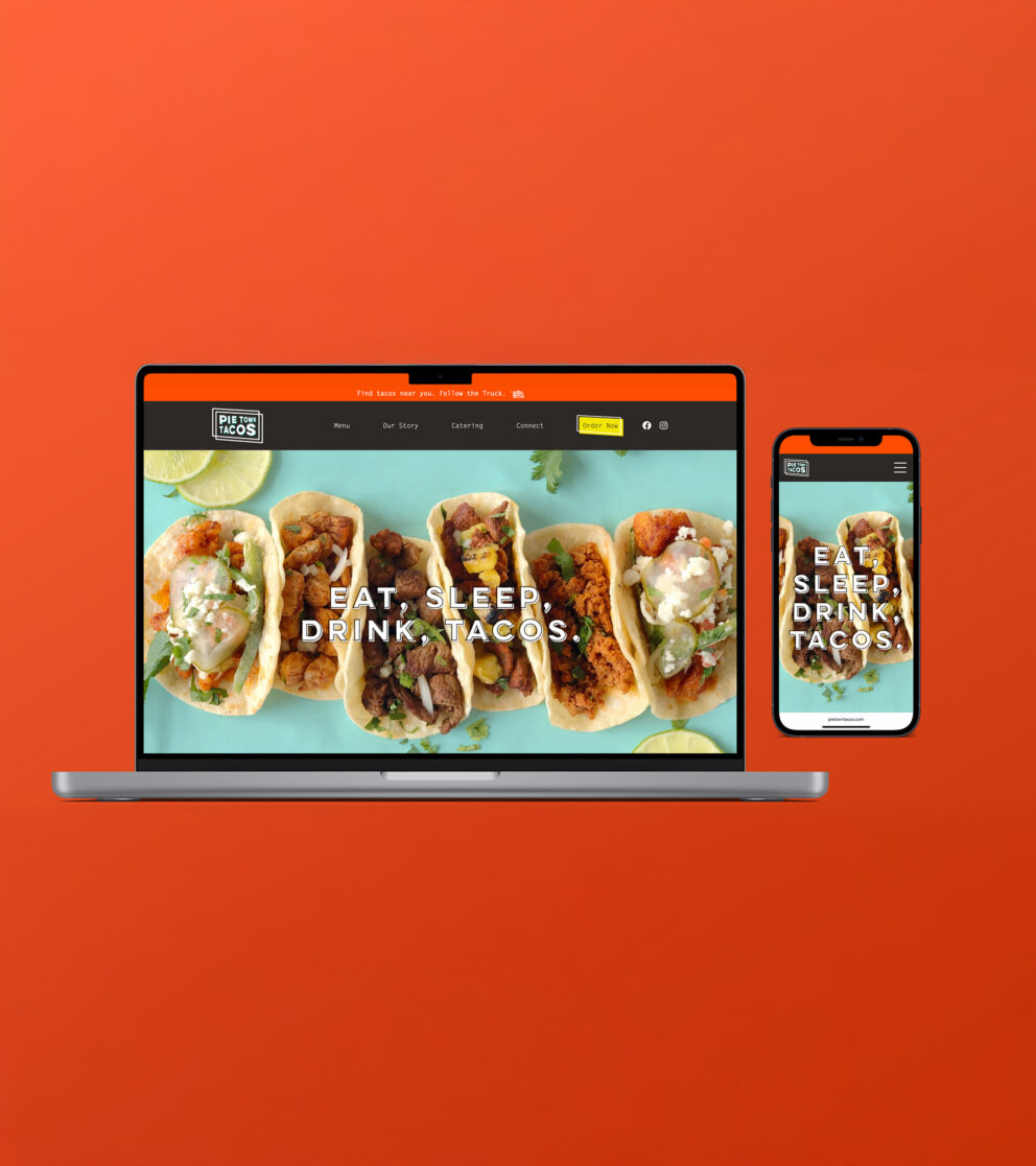
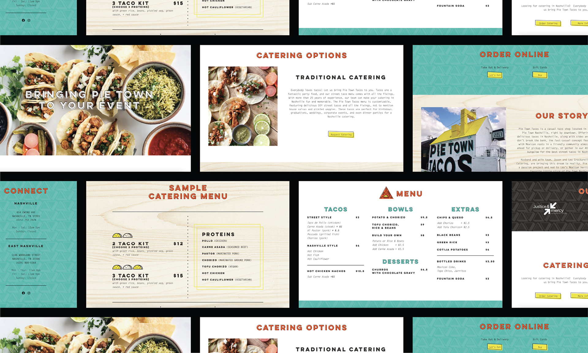
Show ‘em what you’re made of
A brand this bold needed more than just a storefront. It needed a digital home. We created a vibrant single-page website that tells the Pie Town Tacos story, showcases the menu, and brings the brand’s personality to life with a clear call to action: find tacos! Designed not just for the individual taco lover, but for the masses too with catering and private events in high demand across Nashville. The result? A seamless extension of the brand that’s as fun to scroll as the tacos are to eat.
"Working with Visualink on brand identity, website, restaurant signage, and food truck design for Pie Town Tacos was everything we hoped it would be and more. The team was collaborative and encouraging with our ideas, providing the much needed structure to take a vision and translate it into a fun, unique, and scalable brand. We are true believers in Visualink."